Canvas Redesign

Overview
For a 10 week long class project, I researched the problems high students experienced with remote learning and redesigned the test/quiz feature of Canvas to better address students’ needs.
Dates
October 2020 - December 2020
Roles
UX Researcher, UX Designer
The Problem
The pandemic changed how students experience school. Students were forced to adapt to an online learning environment where they were unable to interact with their teachers in person. They also had to deal with distractions that come with learning from home.
Understanding Users
I interviewed 5 high school students, 2 high school teachers, and surveyed 34 more high school students with the goal of:
1. understanding the issues high school students face during the pandemic.
2. understanding how high school students and teachers felt about online testing.
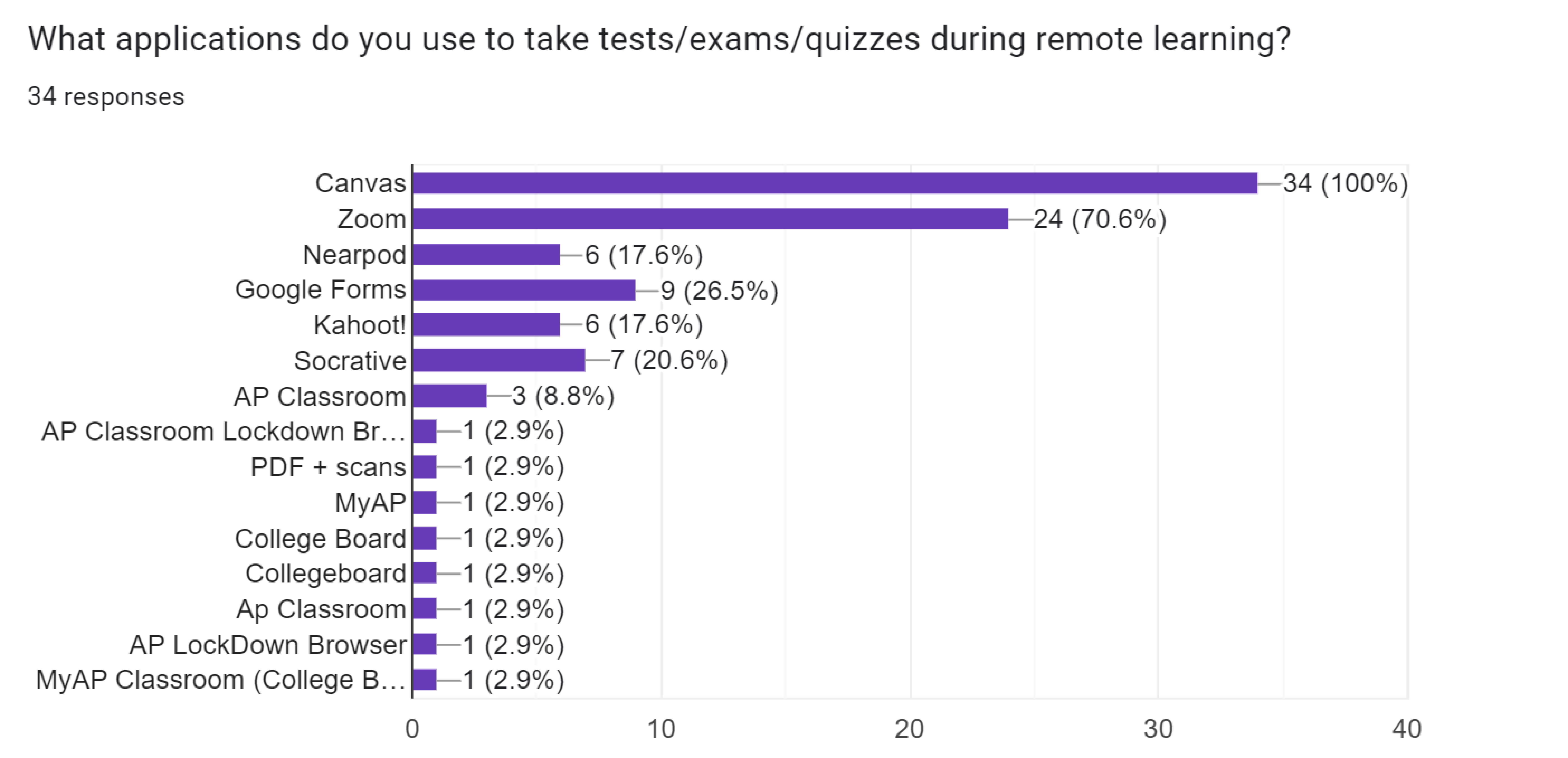
3. seeing what tools, apps, websites, etc students used for school.
Survey and interview results
5 out of the 7 interviewed commented on issues with tests and quizzes being one of the main difficulties with online education during the pandemic.
15 out of the 39 students interviewed/surveyed said online exams were more difficult and more stressful than in-person exams.
Pain Points
-
Online submissions are stressful. 20 out of the 41 students commented on concern for submission mistakes or experiencing technical difficulties while submitting assignments online.

-
Fatigue from screen use. With class being entirely online, students are spending many hours on the computer. 23 out of the 34 surveyed reported suffering screen fatigue.
-
Lack of the physical features of tests. Students like being able to take notes and mark questions to come back to on tests. Furthermore, the online format has opened up more ways for users to make mistakes.

Problem Statement
Due to the pandemic, students are forced to take tests online. But it’s challenging to adapt the physical test format that students are familiar with to a remote learning environment.
How can we better adapt the standard in-person test to an online format and reduce the added stressors for high school students that come with testing online?
Competitive Audit
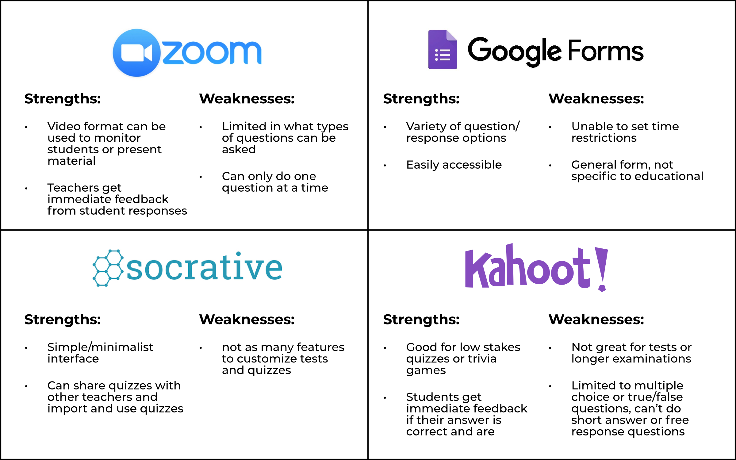
I looked at the most used educational tools from the survey I conducted.

One of the strengths with many of these competitors is the direct interaction between the teacher and student while the questions are being asked. I needed to find a way to improve the communication between students and teachers during testing.

Designing a better online testing experience
Looking at how users can take tests on Canvas
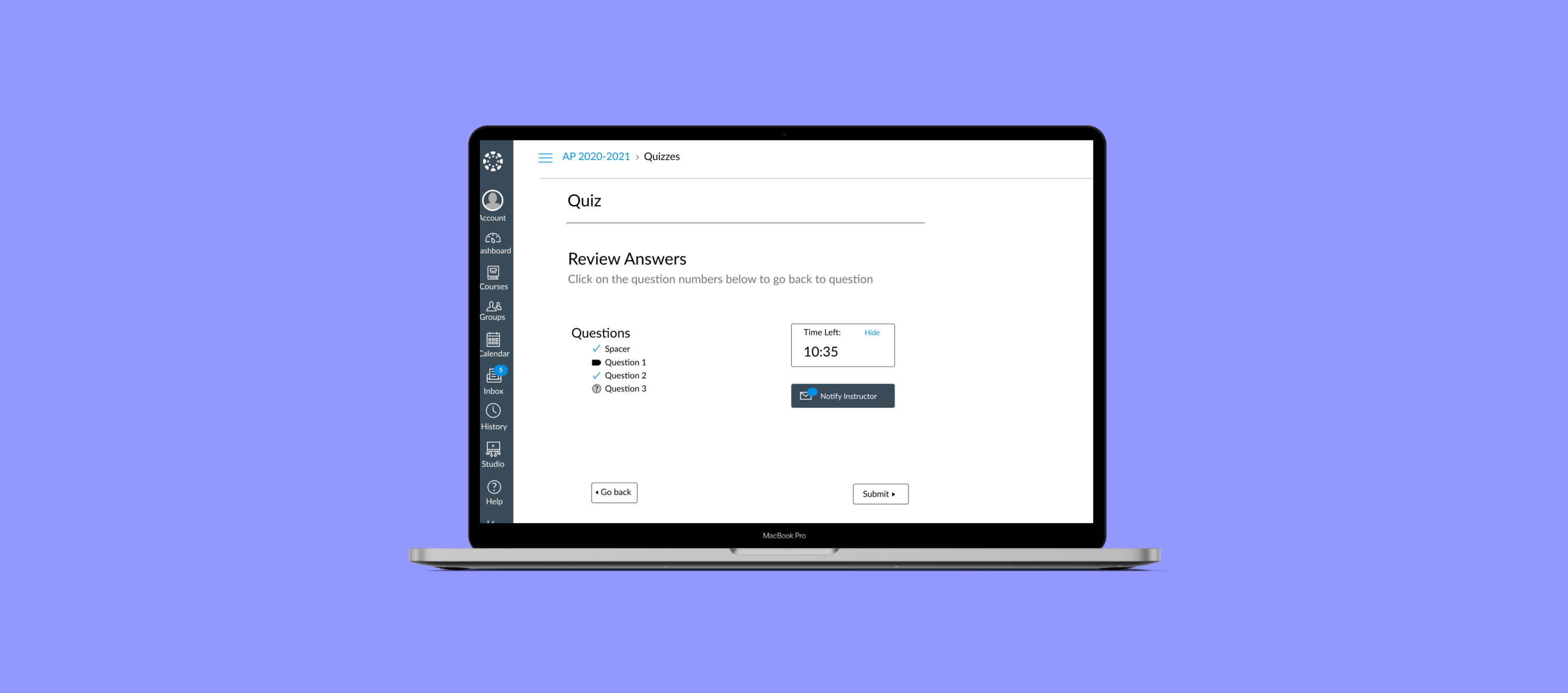
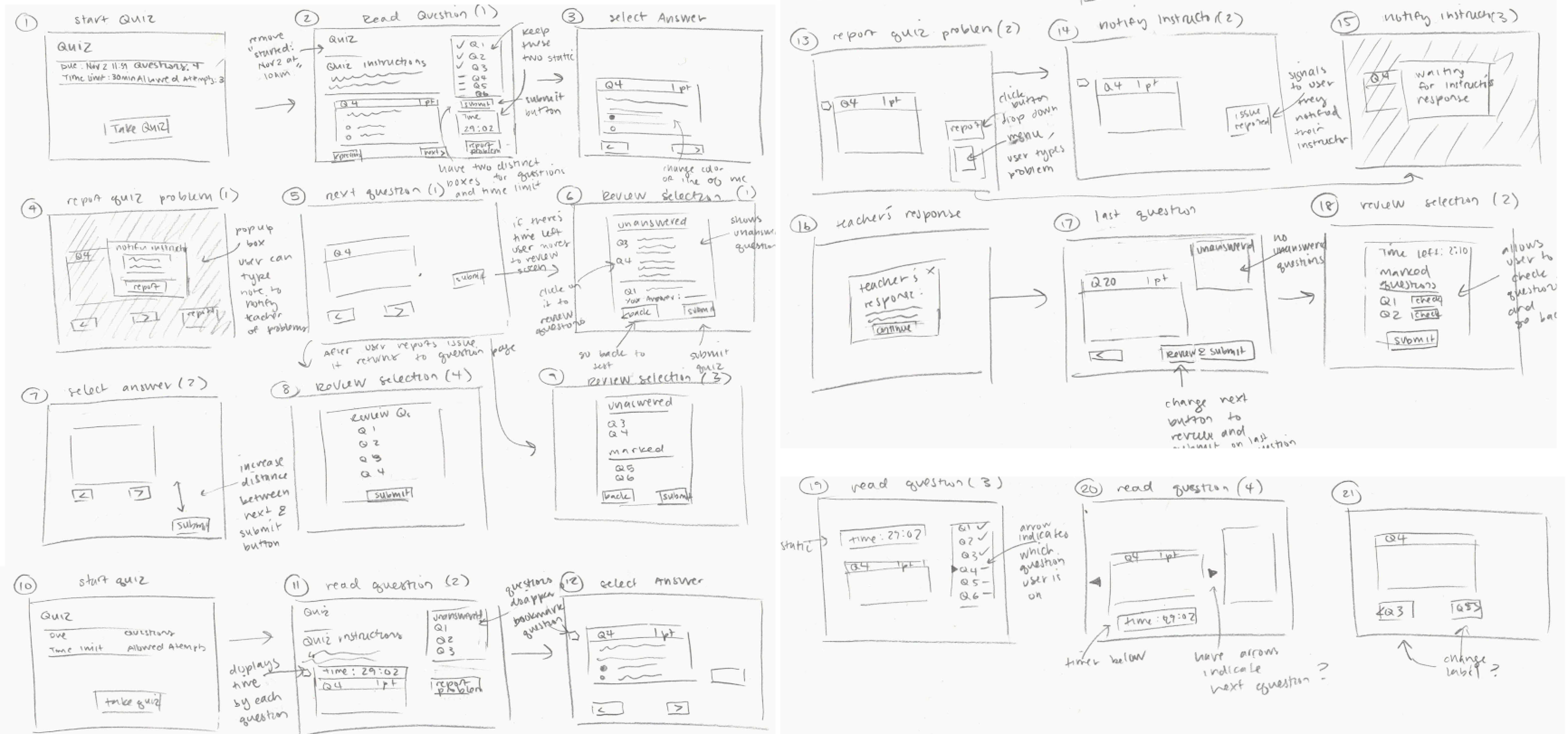
I created 3 separate user flows that would allow users to communicate their testing issues to their teacher during the exam and added a screen to review their answers before submitting the exam.

Sketches & Low-fidelity Prototyping
I was having a problem trying to add new features while reducing the amount of info displayed during the quiz.

I created three different prototypes based on the three user flows to test out different variations of the features I planned to implement in the redesign: the instruction notification button and the review answers page. I had three users test the prototype.
User Feedback and Iterating on Designs
-
Users liked having a review answers summary. A summary of their answers at the end of the quiz provided some reassurance prior to submitting the quiz.
-
Difficulties in using the “notify instructor” message feature. There were mixed reviews among users on the instructor notification feature. On one of the prototype variations, one user said that trying to contact their instructor while taking the exam would be stressful because they might spend too much time trying to ask their question. Another preferred if you could flag and comment on questions individually.
-
High school students and college students had different preferences for reporting quiz issues. High schoolers preferred direct communication between the teacher where they can message them and immediately receive feedback (Prototype B). College students preferred just submitting the issue without having to receive an immediate response (Prototype A).
High-fidelity Prototyping

Feedback on High-fidelity Prototypes
I had three high school students look over the high fidelity prototype and the alternative screens I had for some of the features.
-
Users preferred a submission form over texting. One user felt that texting is stressful in general, so didn’t want that to be a feature on an exam. The other worried about too much time spent to contact the teacher.
-
The messaging feature felt closer to in-person testing. The user that preferred the messaging feature liked how it felt more like direct communication with the teacher like it would be in an in-person test.
-
Text preferred over icons. All three users preferred the first review answers prototype. Users reported that it was easier to understand and it was closer to what they’ve seen in other applications.
Refining the Designs
I ended up combining the ideas from Prototype A and Prototype B, since user were split on which prototype they preferred.


Limitations and Design Opportunities
Issues with Time Differences
The message/chat feature redesign provides immediate communication with students and teachers, but requires that the teacher is online while the student is taking the exam. How can we provide additional assistance for students taking exams asynchronously?
Mobile Design
Although a majority of the students surveyed took tests on a computer, there are students without access to stable wi-fi or computers who have to take the exam on their phone. How can redesign the mobile version of Canvas to accommodate students taking tests on a smaller screen?