ACM at UCSD Website Redesign
Overview
ACM at UCSD is the largest computer science student organization at UCSD.
The organization hosts numerous events and workshops in various areas of technology.
It is committed to fostering a community that’s passionate about computing regardless of background or skill level.
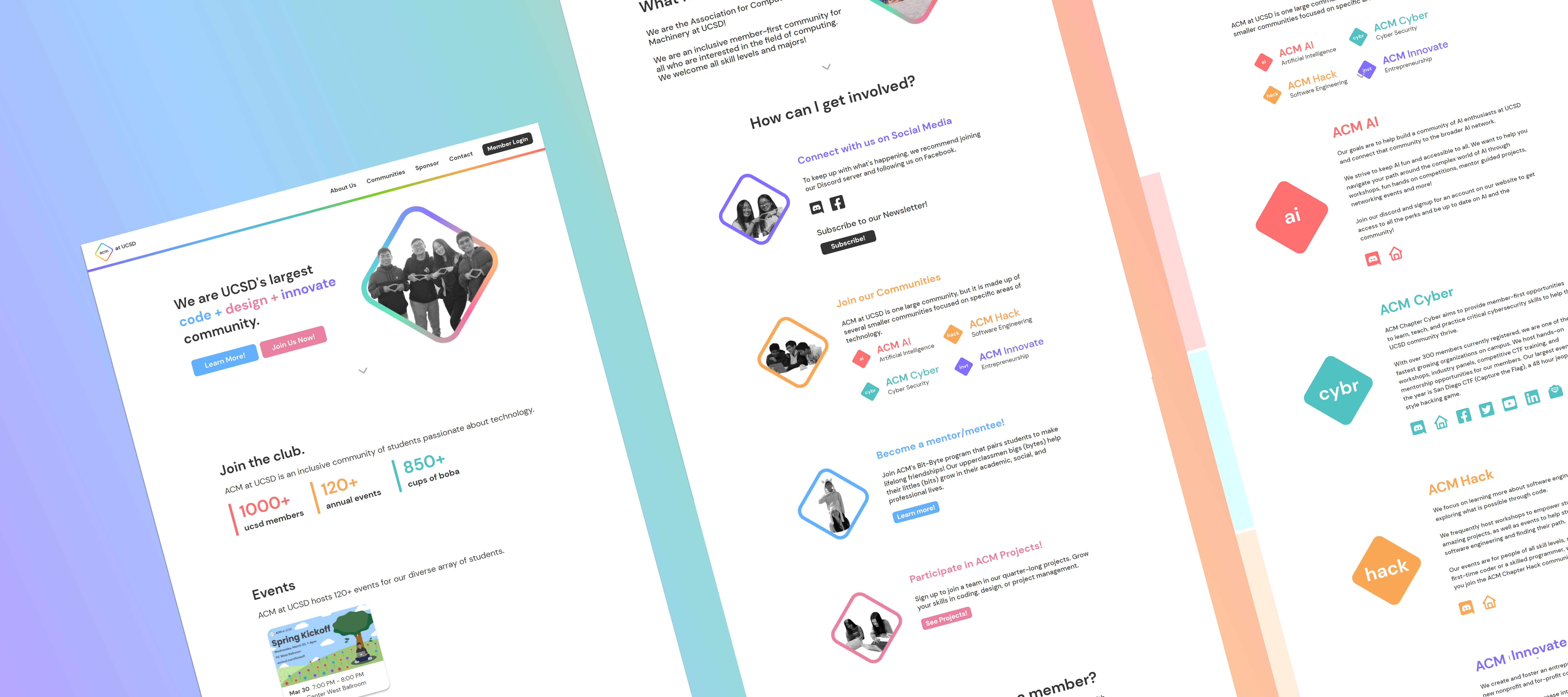
As part of the development team, we were tasked with redesigning the main website with the goal of creating a more member-focused design.
Roles
Lead designer, UX designer, UX researcher
Dates
January 2021-July 2021
Team
PM: Casey Price
Developers: Patrick Brown, Meshach Adoe
Designers: Juliet Zhuang, Tiffany Lee
Understanding current and potential members
We interviewed 6 students that were not acm members and surveyed 6 current acm members to learn about their experiences using the website. Since most acm members had used the website, or at least knew how to access it, we sent a survey through the acm at ucsd discord. We had non members perform tasks to navigate around the website.
Initial Research Findings
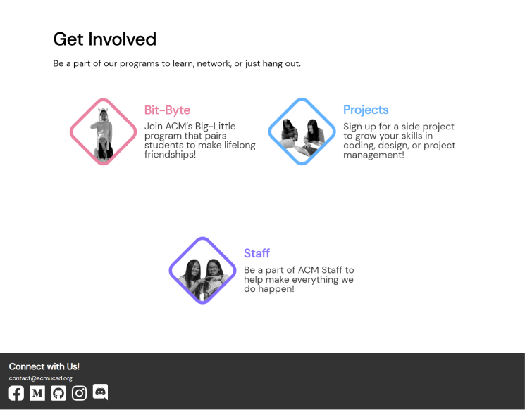
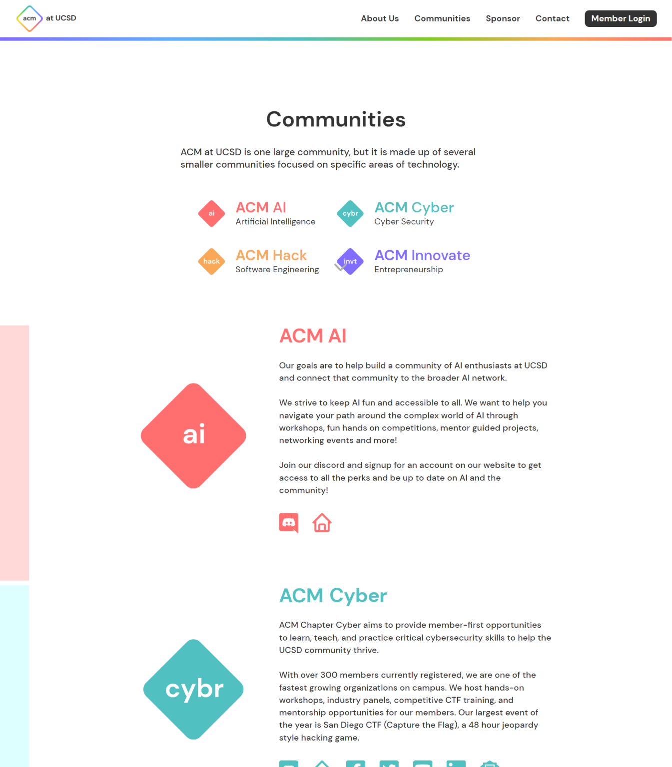
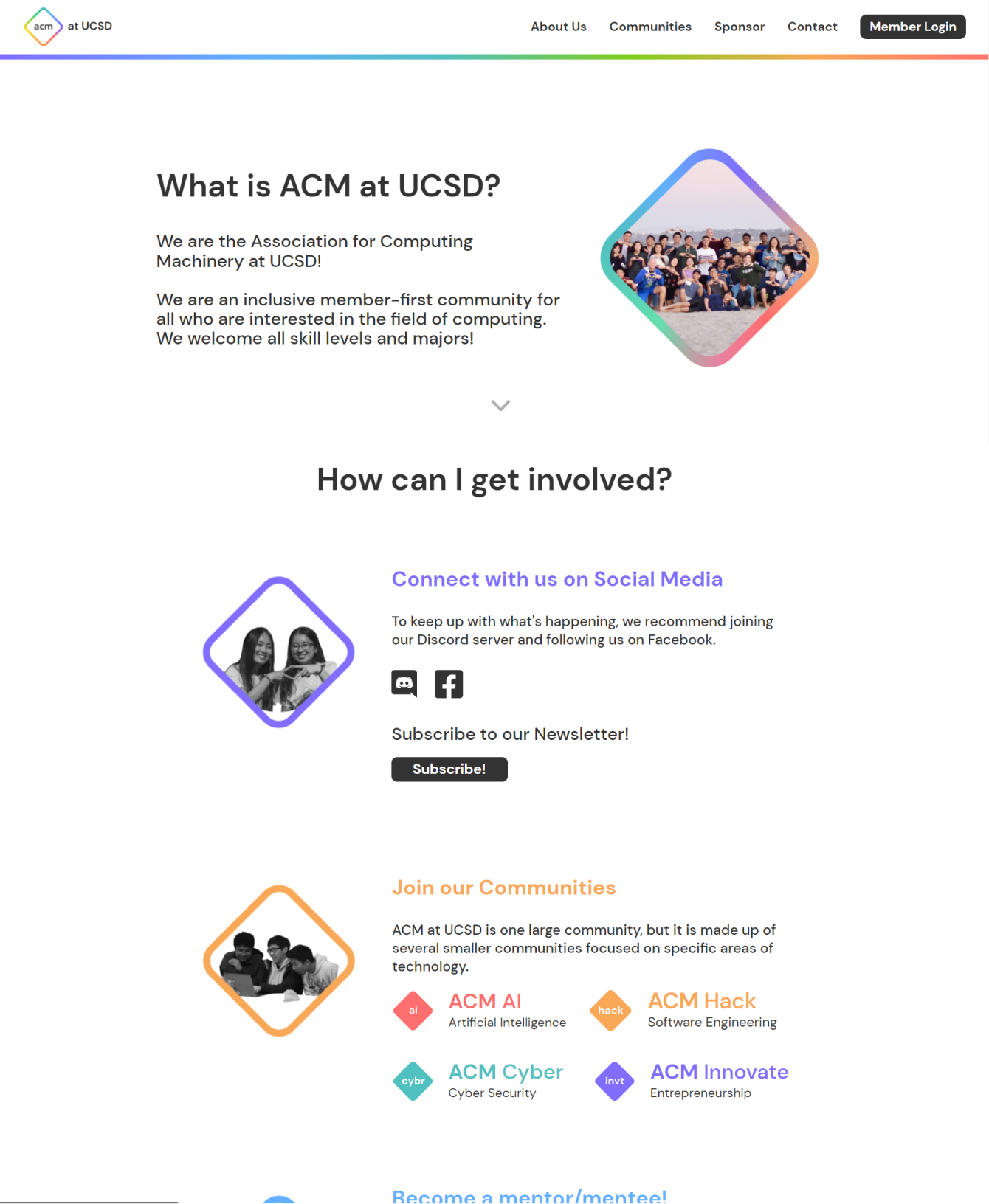
New users lacked important information. The site was missing information about member benefits, communities, and the programs and activities offered.
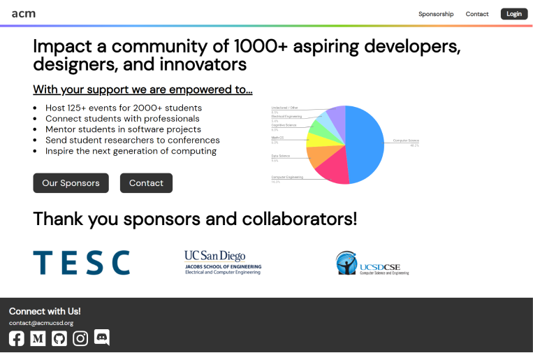
Users liked pictures. Pictures of smiling students made users excited to be part of the organization.
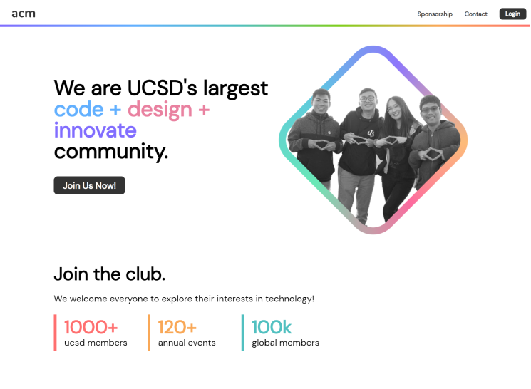
Sponsors lacked information. The site was missing information about sponsor benefits and how to sponsor the organization.
Buttons behaved unexpectedly. Links would send users to confusing locations.
Contact section was overlooked by users. Users would miss the contact section since it wasn't visually salient.
Problem Statement
How can we convey information needed by current members, future members, and sponsors to address their needs while keeping the website concise and minimalist?
Information Architecture

Prototyping and Iterating
We created several iterations of low fidelity prototyping. We made several versions of each page and got feedback from teammates and users.

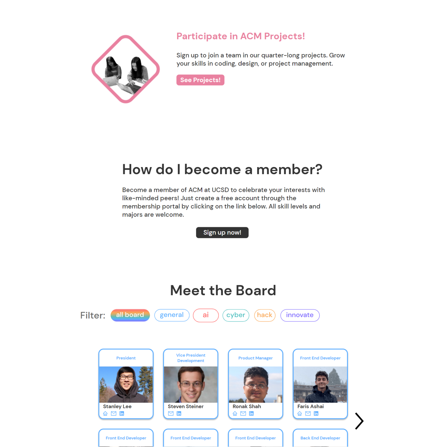
After going through a few iterations of low fidelity prototyping, we moved to working on high fidelity prototypes, where, alongside writing all the content for the website, we focused on what information to include on the event cards, how to display all the board members on the website, and how to format the contact section.
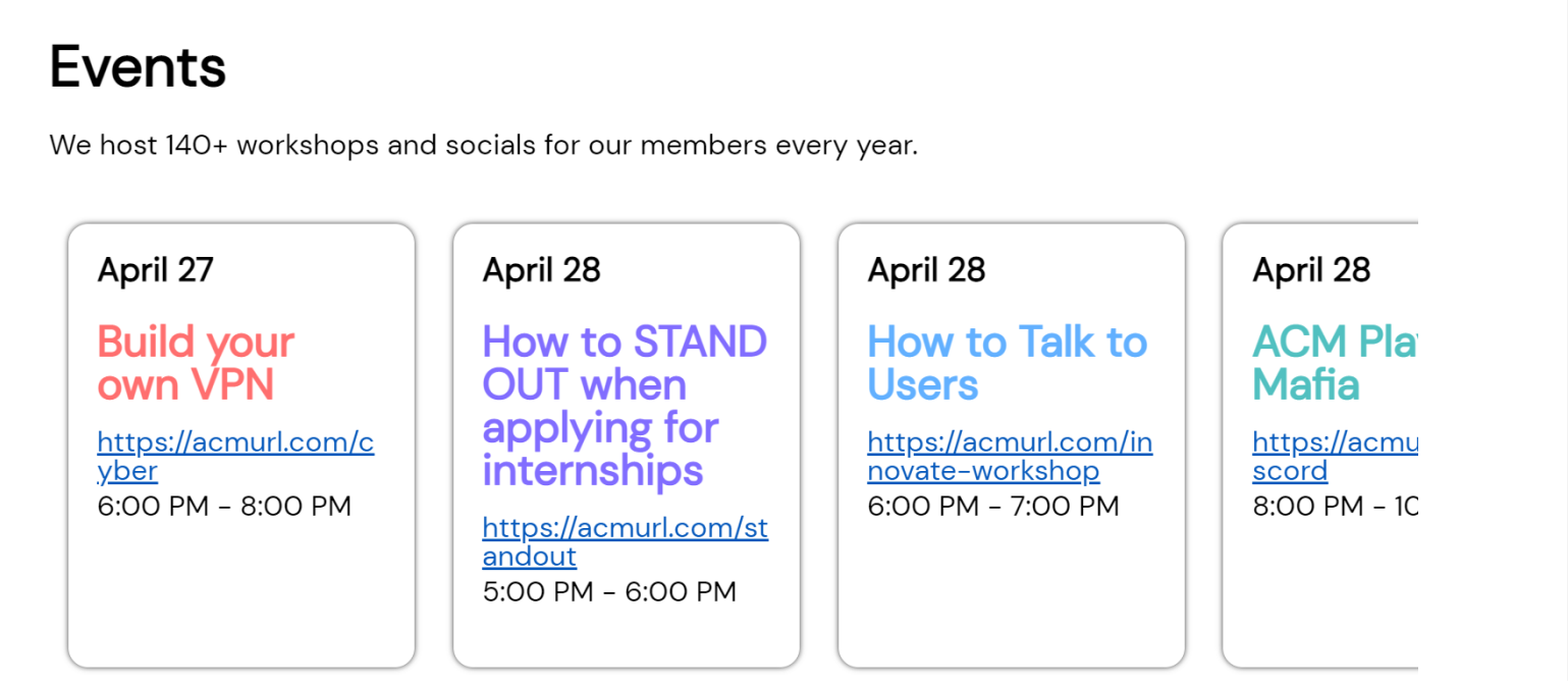
On the old website's event section, since the same type of information was not in the same place on each card, it was harder to read.
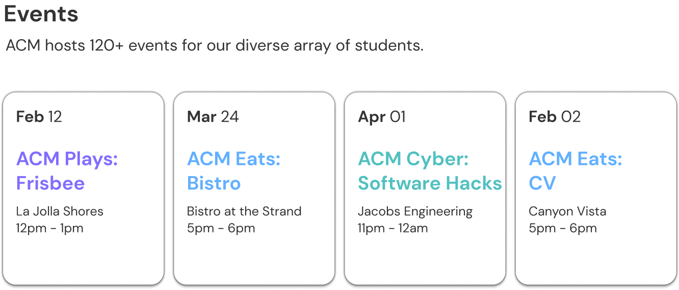
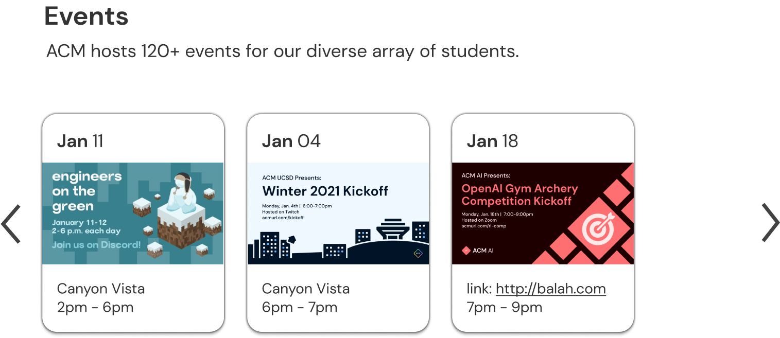
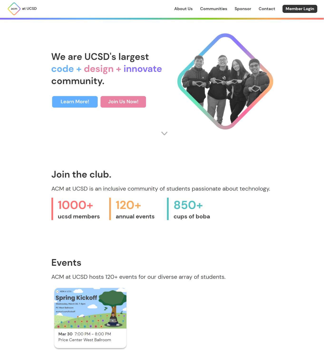
We added images to make each event easier to differentiate.
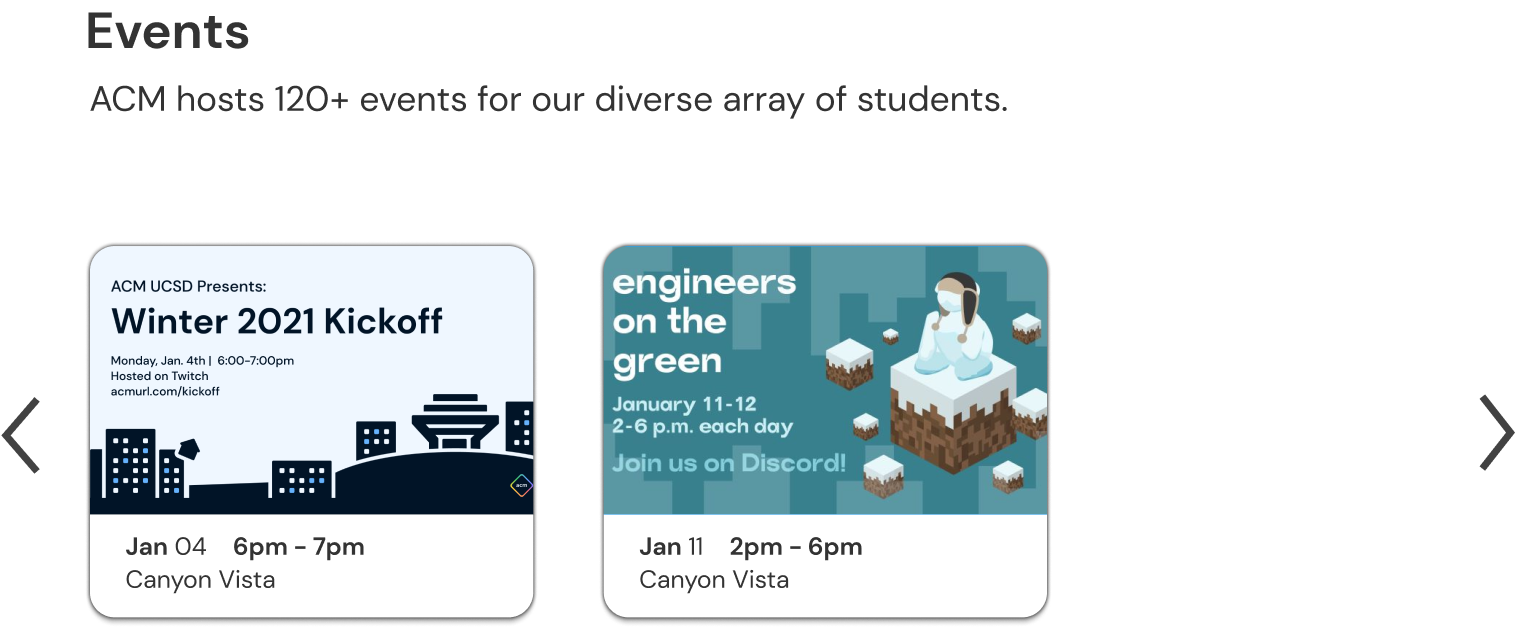
We increased the size of the images to make it easier to read.
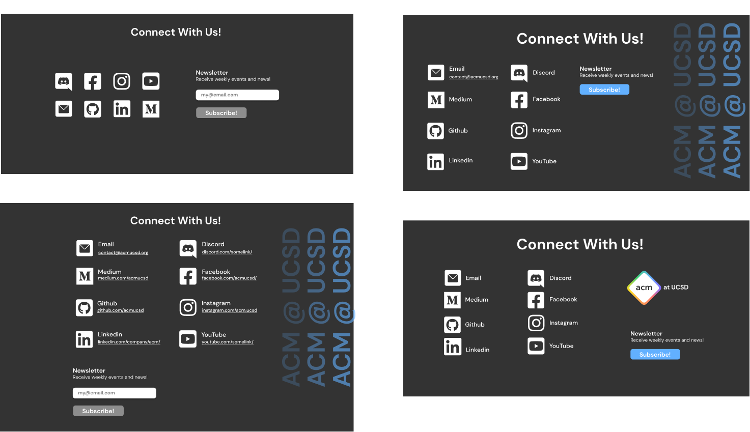
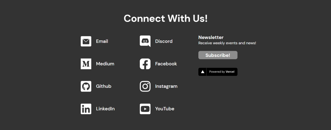
We made so many version of the contact section before deciding on the final design.
Prioritizing changes before finishing
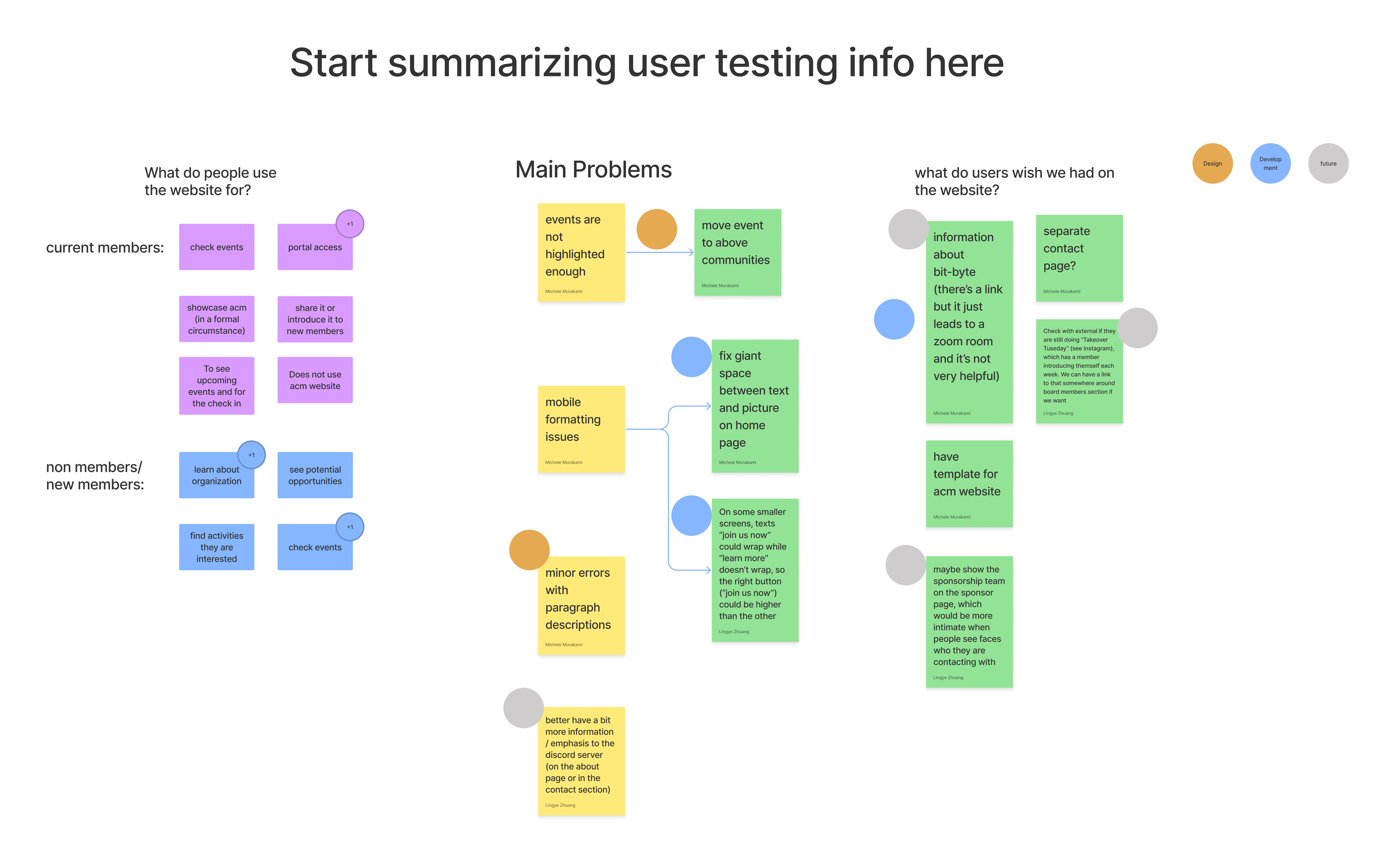
We conducted another set of user testing before putting the website online. We summarized the issues brought up during user testing and then categorized and color coded the issues by the team that would address them.
Mobile Design
Final Design
Next Steps

Improve the sponsorship page. We were unable to interview sponsors and get feedback on their experience with the website. In the future, we would like to get sponsors' feedback and maybe add more pictures of sponsored events.

Show member involvement. We want to add more content showing images or videos of events and showcasing the projects.

Visual Design. There are some inconsistencies with the shapes, gradients, and buttons that we would want fixed in future iterations. Additionally, we would want to redesign the brand.